🛠️ 1. Setup
Requirements
To use Sherlo, ensure the following packages are installed:
react-native
- version 0.64.0 or higher@storybook/react-native
- version 7.6.11 or higher
Install Sherlo
To install Sherlo, run:
- npm
- yarn
- pnpm
npm install -D @sherlo/react-native-storybook
yarn add -D @sherlo/react-native-storybook
pnpm add -D @sherlo/react-native-storybook
Sherlo adds native modules. If you are not using Expo, run:
cd ios
to navigate to theios
folder.pod install
to install the iOS dependencies.
Storybook Component
To enable Sherlo interaction with Storybook, update the Storybook component.
Storybook component is typically exported from .storybook
config directory at your project root.
import AsyncStorage from "@react-native-async-storage/async-storage";
import { getStorybook } from "@sherlo/react-native-storybook";
import { view } from "./storybook.requires";
const Storybook = view.getStorybookUI({
const Storybook = getStorybook(view, {
storage: {
getItem: AsyncStorage.getItem,
setItem: AsyncStorage.setItem,
},
});
export default Storybook;
Storybook Entry Point
To grant Sherlo access to your Storybook, update the Root component.
Root component could be App.jsx
or app/_layout.jsx
, depending on your project structure.
Determine your Storybook build approach:
- Integrated Storybook
- Standalone Storybook
Generates a build with Storybook integrated into your application.
- Single Build: Creates one build containing both app and Storybook
- Runtime Switching: Toggle between app and Storybook during development
- Automatic Access: Storybook is automatically available for testing
import { registerStorybook } from "@sherlo/react-native-storybook";
import Storybook from "./.storybook"; // updated Storybook component
import App from "./App"; // main App component
// Automatically adds Storybook to your build
registerStorybook(() => <Storybook />);
export default function Root() {
return <App />;
}
Wrap UI-related providers (e.g. ThemeProvider
) around both App
and Storybook
to ensure correct rendering.
Example code
import { registerStorybook } from "@sherlo/react-native-storybook";
import Storybook from "./.storybook"; // updated Storybook component
import App from "./App"; // main App component
// ...
registerStorybook(() => (
<SharedProviders>
<Storybook />
</SharedProviders>
));
function SharedProviders({ children }) {
return (
<ThemeProvider>
<SafeAreaProvider>
{children}
</SafeAreaProvider>
</ThemeProvider>
);
}
export default function Root() {
return (
<SharedProviders>
<ThemeProvider>
<SafeAreaProvider>
<AuthProvider>
<App />
</AuthProvider>
<SafeAreaProvider>
<ThemeProvider>
</SharedProviders>
);
}
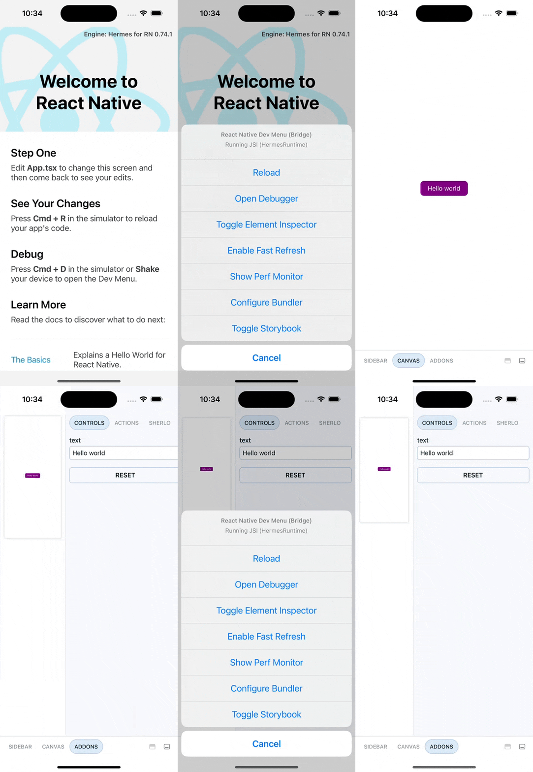
Access Storybook via Dev Menu or openStorybook().
It's not supported by Expo Go, as it depends on native modules.
Dev Menu - Available only in development builds
- Shake your device or press:
- iOS: Cmd ⌘+Ctrl+Z
- Android: Cmd ⌘+M
- Click
Toggle Storybook
to show or hide Storybook.
openStorybook() - Available in all builds
Add a button to open Storybook using the openStorybook()
function.
import { openStorybook } from "@sherlo/react-native-storybook";
import { Button } from "react-native";
function OpenStorybookButton() {
return <Button title="Open Storybook" onPress={openStorybook} />
}
This is useful for internal distribution, as it can be accessed without running a development build.
Optimize the production build by excluding Sherlo and Storybook code.
import App from "./App"; // main App component
if (process.env.ENV !== "production") {
const registerStorybook = require("@sherlo/react-native-storybook").registerStorybook;
const Storybook = require("./.storybook").default;
registerStorybook(() => <Storybook />);
}
export default function Root() {
return <App />;
}
Generates a separate Storybook build independent from your application.
- Separate Builds: Creates individual builds for app and Storybook
- Build-time Selection: Choose between app or Storybook at build time
- Manual Access: You must provide a separate Storybook build for testing
import Storybook from "./.storybook"; // updated Storybook component
import App from "./App"; // main App component
export default function Root() {
// Decide whether to build Storybook ...
if (process.env.BUILD_STORYBOOK) {
return <Storybook />;
}
// ... or app
return <App />;
}
Wrap UI-related providers (e.g. ThemeProvider
) around both App
and Storybook
to ensure correct rendering.
Example code
import Storybook from "./.storybook"; // updated Storybook component
import App from "./App"; // main App component
// ...
function SharedProviders({ children }) {
return (
<ThemeProvider>
<SafeAreaProvider>
{children}
</SafeAreaProvider>
</ThemeProvider>
);
}
export default function Root() {
if (process.env.BUILD_STORYBOOK) {
return (
<SharedProviders>
<Storybook />
</SharedProviders>
);
}
return (
<SharedProviders>
<ThemeProvider>
<SafeAreaProvider>
<AuthProvider>
<App />
</AuthProvider>
<SafeAreaProvider>
<ThemeProvider>
</SharedProviders>
);
}
Make sure to set BUILD_STORYBOOK
environment variable to control the build type.
Optimize builds by importing only the code specific to each build.
import App from "./App";
let EntryPoint; // returns App or Storybook
if (process.env.BUILD_STORYBOOK) {
const Storybook = require("./.storybook").default; // updated Storybook component
EntryPoint = () => <Storybook />;
} else {
const App = require("./App").default; // main App component
EntryPoint = () => <App />;
}
export default function Root() {
return (
<App />
<EntryPoint />;
);
}